

White Ink on Wood Business Cards: When to Use a White Base Layer
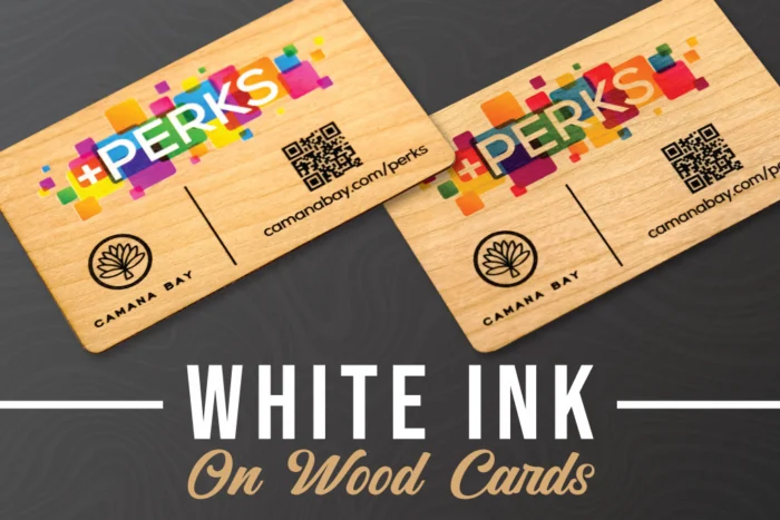
Wood business cards have a completely different look and feel from standard printed cards. The natural grain, tone, and texture of the wood all become part of the design, which is exactly what makes them so memorable.
But because wood is not a bright white surface, printed colors can look different than they would on paper or plastic. That is where a white ink on wood business cards comes in.
A white base layer is an optional print layer added behind your design to help colors appear brighter, cleaner, and more vibrant on the wood. It is especially helpful when your artwork includes full-color logos, lighter shades, gradients, or brand colors that need to stay as accurate as possible.
That said, a white base layer is not always the right choice for every design. Sometimes, letting the ink print directly onto the wood creates a softer, more natural look that allows more of the wood grain to show through.
Here is how to decide when a white base layer makes sense for your wood business cards.
What Is a White Base Layer?
A white base layer is a layer of white ink printed underneath the colored areas of your design. Instead of printing color directly onto the wood, we first print white behind the artwork, then print the color on top.
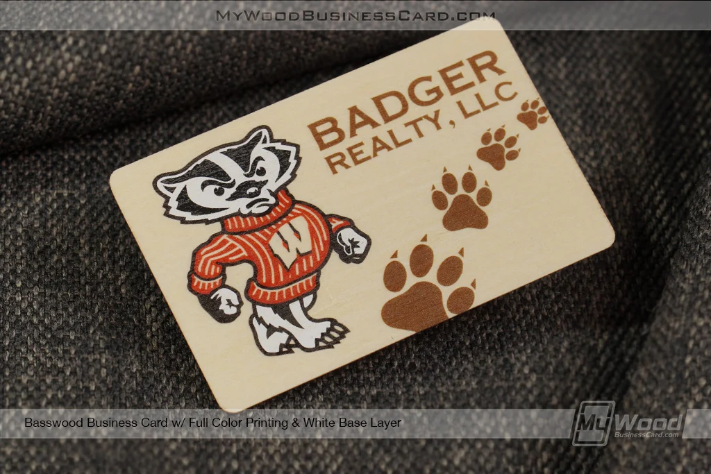
Think of it like painting on a wood surface. If you paint directly onto darker or warmer wood, the wood color will influence how the paint appears. If you add a white primer first, the color on top looks brighter and more true to the original shade.
The same idea applies to custom wood business cards.
Because wood has its own natural color, printed ink can appear slightly muted, warmer, or more transparent without a white base layer. The white layer helps block some of that natural wood tone, so the printed colors can stand out more clearly.
Why Printed Colors Look Different on Wood
Wood is a natural material, not a blank white canvas. Every wood type has its own tone, grain pattern, and surface character.
A light wood may give colors a soft, warm appearance. A darker wood may make certain colors look deeper or less visible. Strong grain patterns can also show through the printed areas, which can be beautiful when that is the look you want.
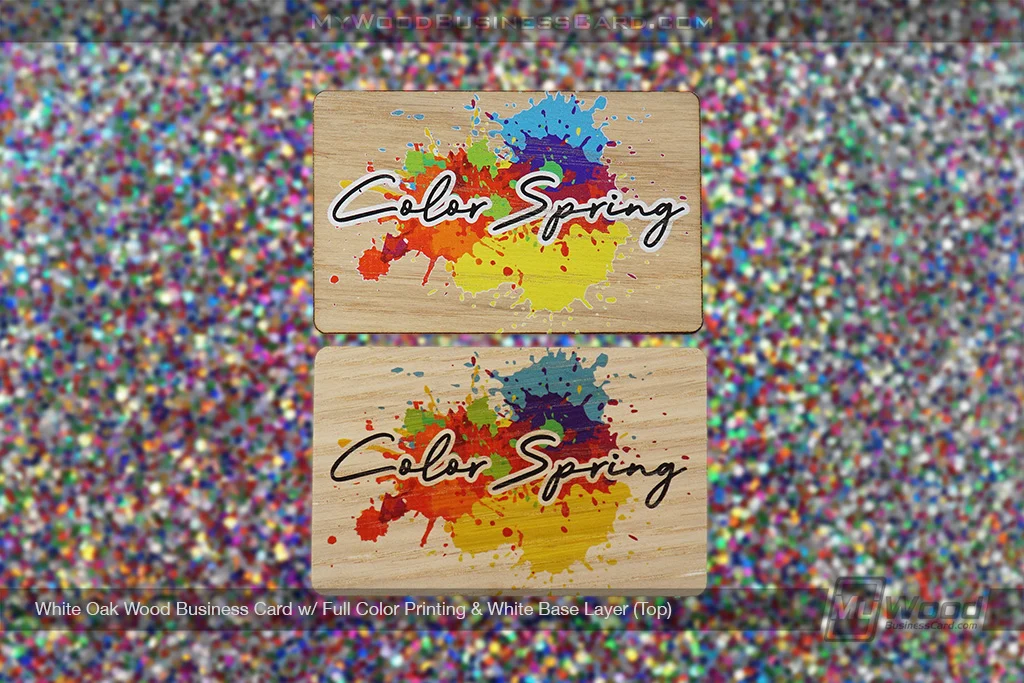
This is part of what makes wood business cards so unique. No two pieces of wood are exactly the same, so the final card has a natural, organic quality that standard paper cards cannot really replicate.
The tradeoff is that printed colors may not look as bright or solid as they do on screen. A white base layer helps create a lighter foundation behind the print, giving your design more color impact.
When to Use White Ink on Wood Business Cards
A white base layer is a great option when you want your printed design to look brighter, bolder, and more vibrant.
It is especially helpful for logos or artwork with specific brand colors that need to stand out clearly. If your logo includes blues, reds, yellows, greens, or other saturated colors, adding white ink behind the design can help those colors appear more vivid on the wood surface.
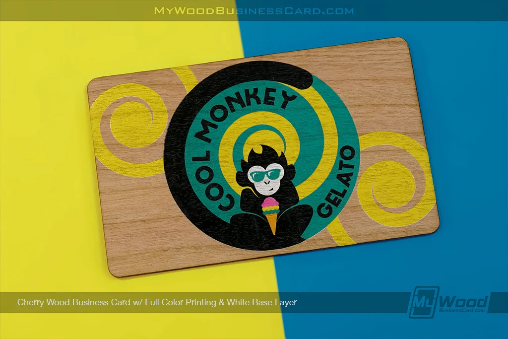
A white base layer is also useful for designs with lighter colors, thin details, or full-color artwork. Without white ink on wood business cards, pale colors may blend into the wood more than expected. White gives them a stronger base so they are easier to see.
You may want to add a white base layer if your design includes:
Clear brand colors that need to stay bright
Light colors that could get lost on the wood
Full-color logos or illustrations
Small design details that need more contrast
A polished, high-visibility printed look
If your goal is for the design to pop, a white base layer is usually worth considering.
When to Skip the White Base Layer
Not every wood business card needs white ink underneath the design. In fact, some designs look better without it.
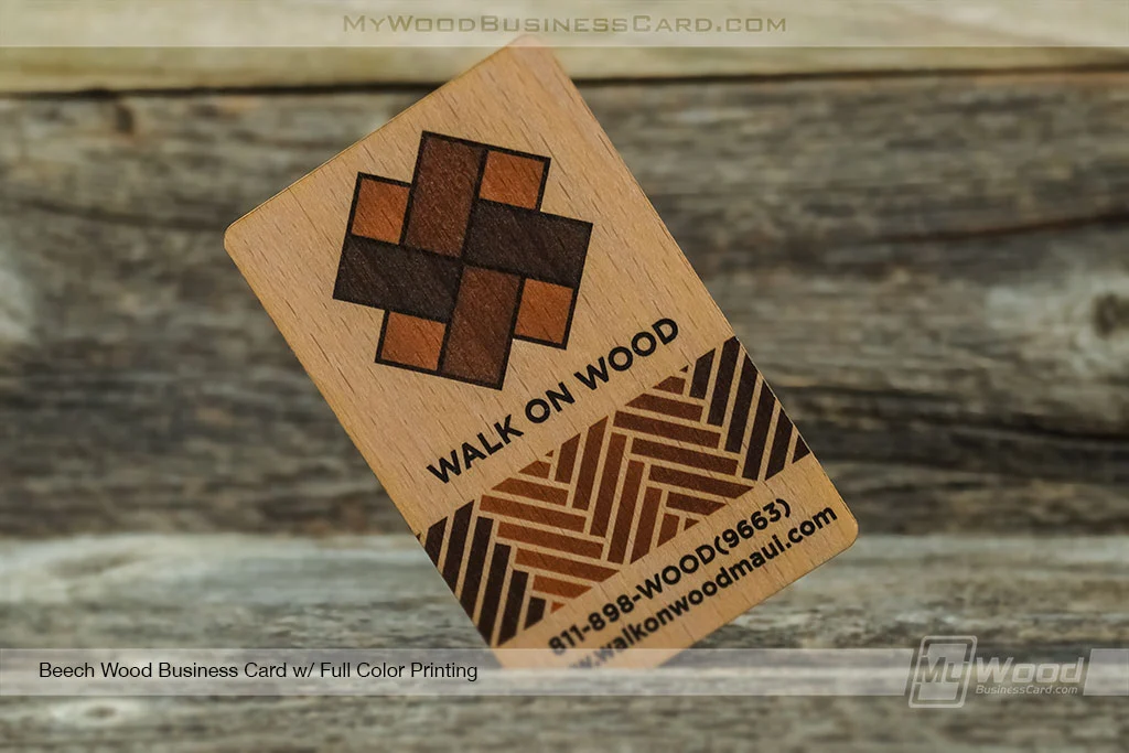
If you want more of the natural wood grain to show through the printed areas, printing directly onto the wood can create a softer and more organic finish. The colors may appear more subtle, but the result can feel very warm, natural, and premium.
This can be a great choice for minimalist logos, simple black artwork, earthy brand styles, or designs where the wood itself is meant to be a major part of the overall look.
You may want to skip the white ink on wood business cards if you prefer:
A more natural wood-grain effect
Softer, more transparent-looking colors
A rustic, organic, or handcrafted feel
Simple black or dark artwork
A design where the wood texture is part of the visual appeal
Without the white ink on wood business cards, the printed colors and wood interact more directly. That can make the final card feel less like a printed object and more like a design that belongs on the wood itself.
The Difference Between Vibrant Color and Natural Wood Tones
The biggest decision usually comes down to this: do you want the print to stand out more, or do you want the warmth of the wood to show through more?
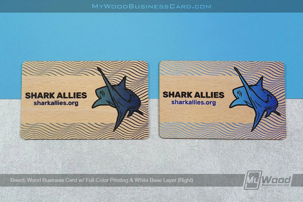
White ink on wood business cards gives you a brighter, more solid-looking color. It helps separate the artwork from the wood tone underneath, which can make logos and printed details easier to see.
Printing without a white base allows more of the natural wood to influence the design. The colors may be less intense, but the tone of the wood becomes more visible through the printed areas.
Neither option is automatically better. It depends on the look you want.
If your brand is bold, colorful, modern, or highly polished, the white base layer may be the better fit. If your brand is natural, understated, rustic, or minimalist, printing without the white base may give you a more fitting result.
Why Black Walnut Includes a White Base Layer
Most of our wood business cards can have a white base layer added for an additional cost. The one exception is Black Walnut.
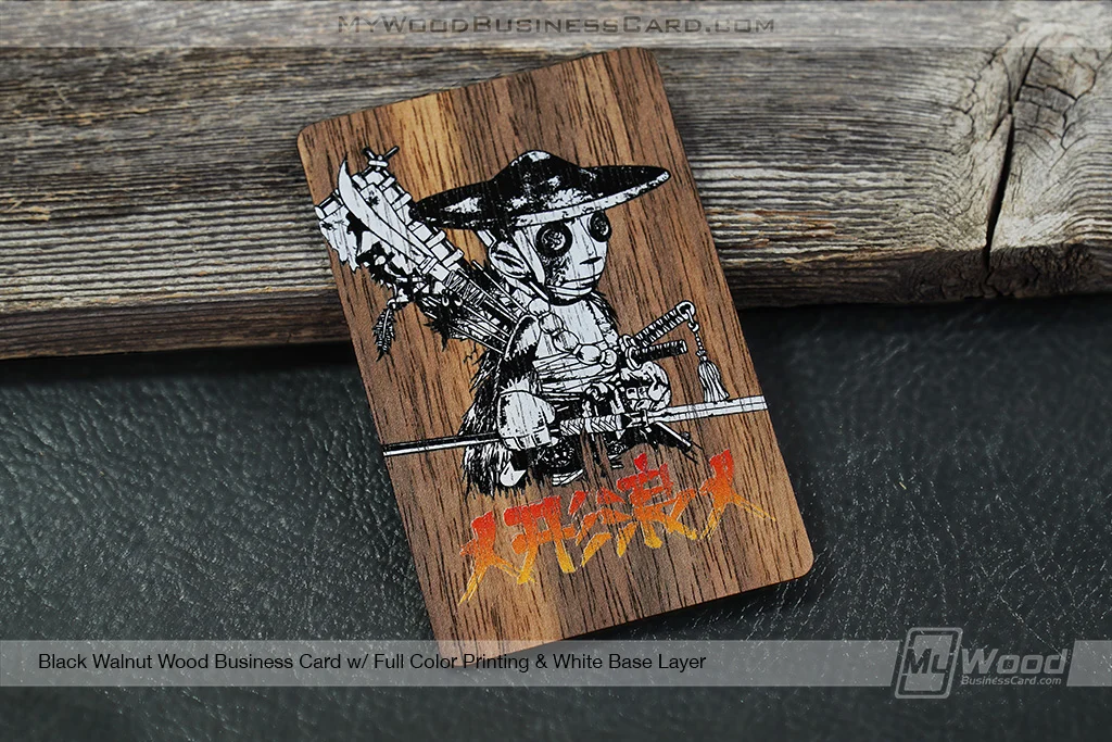
Black Walnut is naturally dark, so we include the white base layer as part of the standard print process for that wood style. Without it, many printed colors would not show up clearly enough against the darker surface.
The white base helps create the contrast needed for the artwork to be visible while still allowing the card to keep the rich, premium look of Black Walnut wood.
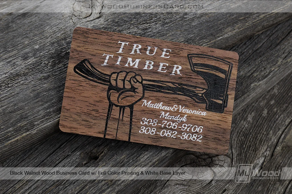
For lighter wood types, the white base layer is optional because the natural surface already gives printed colors a brighter starting point. For Black Walnut, it is included because the darker wood needs that extra support behind the ink.
Does a White Base Layer Cover the Wood Completely?
A white base layer is printed behind the artwork, not across the entire card unless the design specifically calls for that type of effect. Its purpose is to support the printed design areas, not erase the wood.
The visible wood background, grain, and natural character are still part of the card. White ink on wood business cards simply helps the printed portions appear brighter and more defined.
This means you can still get the beauty of a real wood business card while giving your logo or artwork more visual strength.
Which Option Is Right for Your Design?
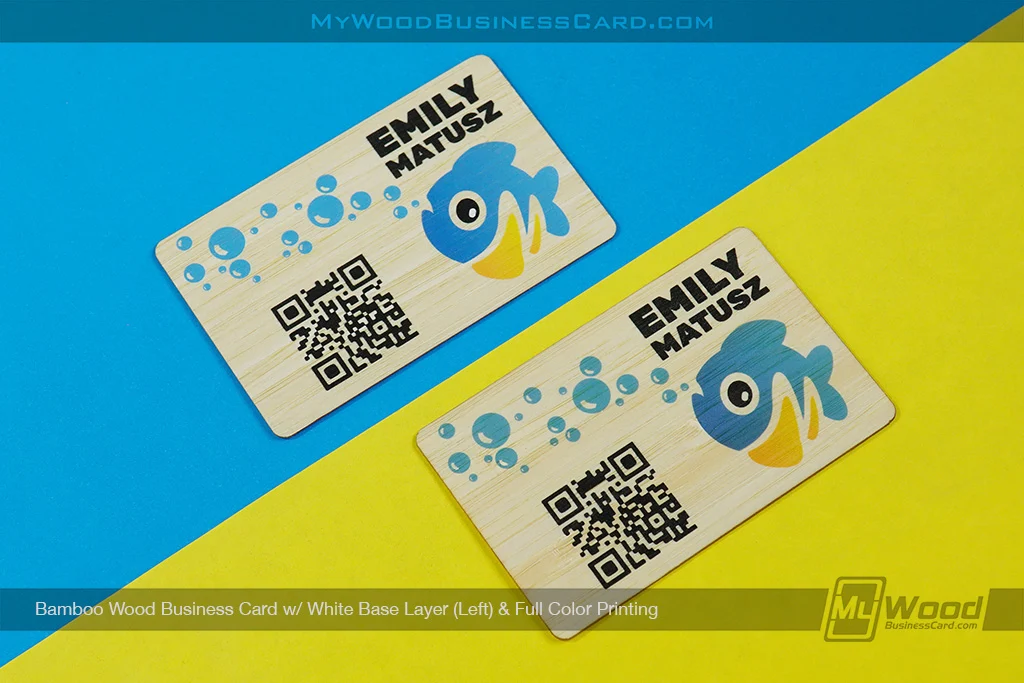
If you are unsure whether to add a white on wood business cards, think about what matters most for your card.
If brightness and logo visibility are the priority, a white base layer is a smart choice. It gives your artwork a cleaner foundation and helps the colors show up with more impact.
If you want a more natural, subtle, wood-forward look, you may prefer printing without a white base. This allows the grain to show through more and gives the card a softer, more organic finish.
Both options can look beautiful. The right choice depends on your artwork, your wood selection, and the impression you want your card to make.
The White Decision
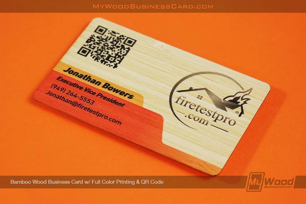
White ink on wood business cards can make a big difference in how your wood business cards turn out. It helps printed colors look brighter, more vibrant, and easier to see, especially on darker wood or designs with full-color artwork.
But sometimes, the best part of a wood card is the natural grain shown through the design. Skipping the white base can create a more subtle, earthy look that feels just as intentional.
The key is knowing what kind of finish you want. For bold color and stronger contrast, choose the white base layer. For a more natural wood-grain effect, let the ink print directly onto the wood.
Either way, your card will still have what makes wood business cards so special: a natural material, a memorable feel, and a design that stands out from ordinary paper.