

How Wood Grain Changes Your Business Card Design
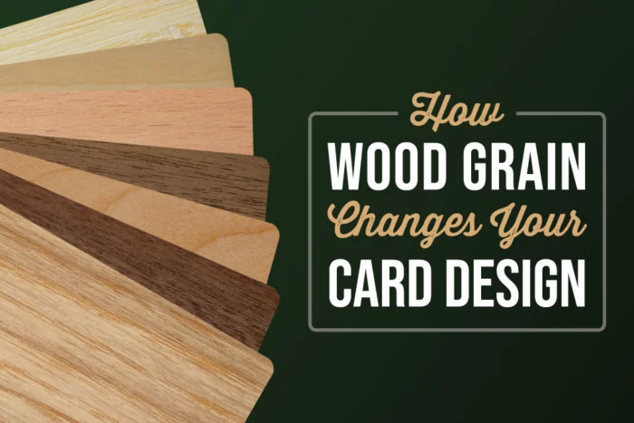
A business card design usually starts with a blank canvas. With a wood business card, the canvas already has a design of its own.
Natural grain, subtle shifts in color, and variations from one piece of wood to another all become part of the finished card. Instead of printing a design onto a perfectly uniform surface, you are creating artwork that must work with the material underneath it.
That is one of the biggest differences between designing paper, plastic, and wood business cards. Wood grain is not something you necessarily need to hide or work around. Used intentionally, it can become one of the most interesting parts of the design.
Here is how natural wood grains can change the way your business card looks, feels, and ultimately represents your brand.
1. Every Wood Business Card Has Natural Variation
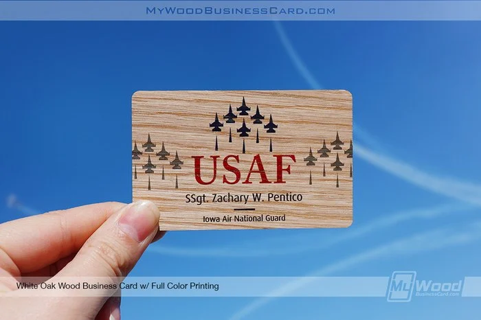
One of the most noticeable characteristics of real wood is that it is not perfectly uniform.
The grain pattern can shift across the surface, and natural variations in tone and texture can appear from card to card. That means two cards produced with the same artwork can still have subtle differences in their finished appearance.
And that is part of the appeal.
Those variations help reinforce that you are handing someone a card made from real wood rather than a material designed to imitate it. Each card has its own natural character while still carrying the same branding and contact information.
For businesses drawn to craftsmanship, natural materials, or an organic aesthetic, that variation can strengthen the overall presentation.
2. The Wood Grain Becomes Part of the Artwork
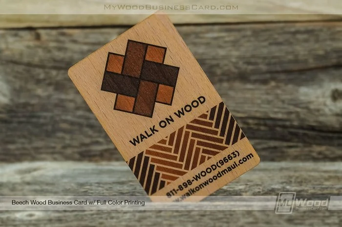
On a traditional white business card, the background mostly stays out of the way. With wood, the background has movement.
Lines and patterns within the grain remain visible around and sometimes within your artwork, giving the design additional texture without requiring you to add a printed pattern or graphic.
This makes negative space especially valuable.
Instead of covering every available area, a design can leave portions of the wood exposed and allow the natural material to provide some of the visual interest. A logo, name, and a few carefully placed details can feel much more intentional when surrounded by visible grain.
The card itself is already doing some of the design work.
3. Contrast Matters More on a Natural Surface
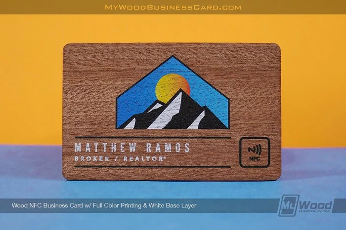
Wood is not a perfectly white, digitally controlled background, so contrast deserves extra attention when designing your card.
Fine details, small text, and colors that are too close to the natural tone of the wood may not create the same visual separation they would on paper or another uniform surface.
The goal is not necessarily to overpower the wood. It is to create enough distinction that your important information remains easy to identify while still allowing the material to show through.
Think about your design in terms of hierarchy:
- What should someone notice first?
- Which information needs to be easiest to read?
- Where can you allow more of the natural wood to remain visible?
- Does every design element need to be there?
Answering those questions can lead to a cleaner card and make the wood itself feel like an intentional part of your branding.
4. Simpler Designs Can Let the Material Stand Out
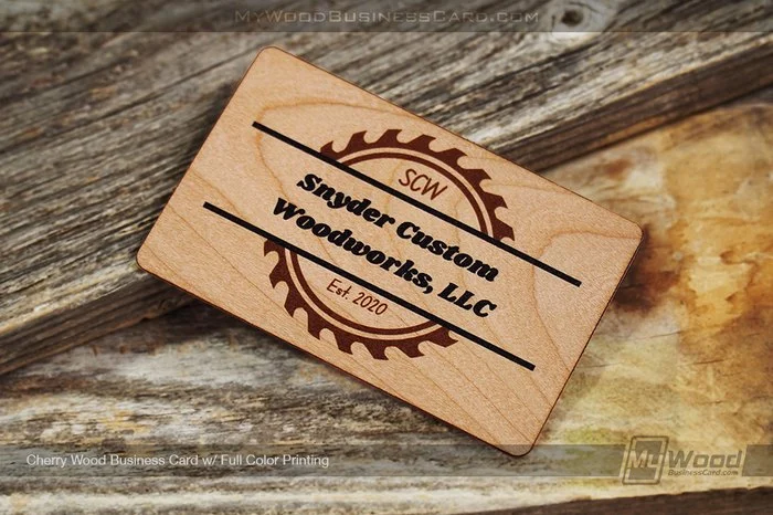
A wood business card already has more visual texture than a plain paper card, so you may not need to add as much to make the design interesting.
Strong logos, clean typography, intentional spacing, and uncomplicated layouts can give the grain room to breathe.
That does not mean wood cards have to be minimal. Detailed artwork can still create an impressive result. But when choosing what to include, it is worth remembering that the wood itself contributes to the overall look.
Sometimes removing an unnecessary graphic or background element allows the natural material to have a bigger impact.
5. Wood Can Reinforce the Personality of Your Brand
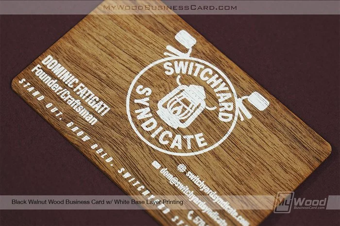
Material choice communicates something before the recipient reads a single word.
Wood has an immediately recognizable look and feel that can work especially well for brands that want to emphasize qualities such as craftsmanship, authenticity, creativity, or a connection to natural materials.
That makes wood business card design particularly interesting for industries where the material itself can complement the brand.
A woodworking or construction company, for example, has an obvious connection to wood. The same can be true for landscaping, outdoor brands, makers, artisans, architects, designers, hospitality businesses, and other companies looking for something warmer and more tactile than a conventional card.
But your business does not have to work with wood for the material to make sense. Sometimes the contrast is exactly what makes it memorable.
A modern logo paired with natural wood can create an unexpected combination that feels distinctive without relying on an unusual card shape or an overly complicated design.
6. Wood Can Reinforce the Personality of Your Brand
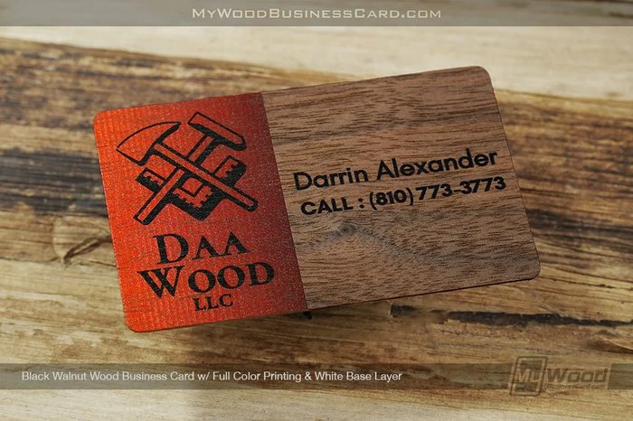
Texture is often something designers have to simulate.
Wood gives it to you naturally.
The grain creates subtle visual movement across the card, so even a relatively simple design can look more dimensional when viewed up close. As the card moves in someone’s hand, those natural details become more noticeable.
That is important because business cards are physical objects. They are not only viewed straight-on like a digital graphic. They are picked up, turned over, passed between people, and examined from different angles.
With wood, the material rewards that closer look.
6. Your Digital Proof and Finished Card Will Not Be Identical Experiences
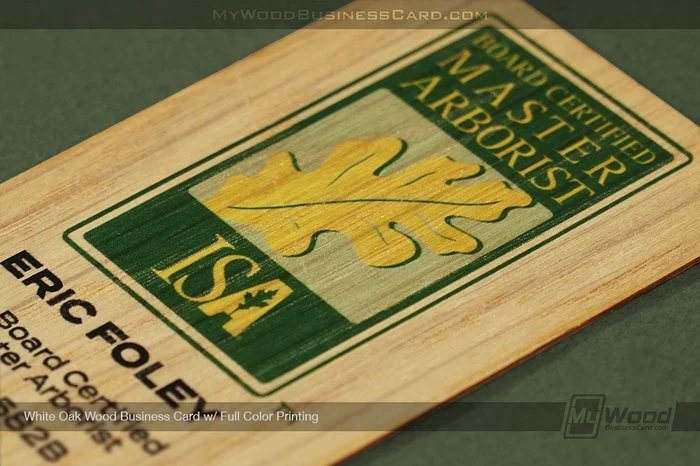
This is an important distinction when designing for any natural material.
A digital proof can show you the placement, sizing, layout, and overall direction of your artwork. What a screen cannot completely reproduce is the physical character of real wood.
Natural grain and variations in the material mean the finished cards have an element that simply cannot be replicated by looking at a flat digital image.
That is not a flaw in the process. It is part of choosing a natural material.
When evaluating your design, focus on whether the artwork has a strong hierarchy, readability, and enough room for the wood to contribute to the finished appearance.
7. You Are Designing the Card and the Experience
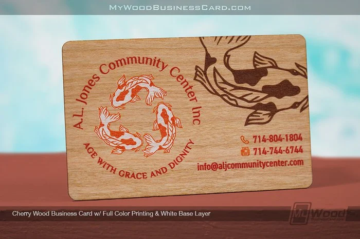
The biggest advantage of wood grain may not be any single visual characteristic. It is what happens when all of those characteristics come together.
Someone sees the natural surface. They notice the grain. They pick up the card and realize it is actually made from wood. Then they look more closely at the design.
That creates an interaction that a conventional card may not generate.
A business card only has a few seconds to make itself worth keeping. Choosing an unusual material gives you another opportunity to create that moment before the recipient has even finished reading it.
8. Design With the Wood, Not Against It
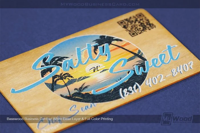
The best wood business card designs do not treat the material like a blank sheet of paper.
They take advantage of what makes wood different.
Natural grain can add texture. Variation can make individual cards feel unique. Exposed wood can create visual interest without adding more graphics. And the material itself can reinforce the personality behind your brand.
When your artwork and the natural wood work together, the grain stops being just the background.
It becomes part of the design.
Ready to see what your design looks like on real wood? Explore our custom wood business cards and turn your branding into something people can see, feel, and remember.